Showing posts with label iconic brand. Show all posts

Friday, January 15, 2021

Brand Update : Tata Safari is back to Reclaim Your Life

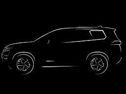
 It's happy news for Tata Safari fans. Tata Motors has decided to relaunch the iconic Tata Safari in a new platform. The brand which created the premium SUV market in India was languishing in the sidelines when the Indian market was gravitating towards SUVs. After 2016, there was no product improvements nor any campaigns. The only saving grace for the brand was that it was chosen by Indian armed forces to replace Maruti Gypsy.

Then Tata Motors did a coup. It began to launch a range of products under a more refined platform. Harrier was launched in the Land Rover platform quickly began to impress the customer with its road presence and refinement. I almost believed that Safari will be silently killed and the new era belonged to new brands. Tata Motors then began its work on a 7 seater SUV which was showcased as a new brand Gravitas. 

But then the twist happened. The 7 seater Harrier was decided to bear the name of Safari. The teaser ad is now on air and what is interesting is that the brand is retaining the tagline Reclaim Your Life. 

The advantage of launching Safari is the immediate adoption by Safari fans. Although many have migrated to other SUVs, still Safari brand commands a lot of traction among the auto-enthusiasts. Since Harrier has already established itself as a reliable machine, Safari will not have to worry about the mechanical issues which were the Achilles heel of the brand in its earlier avatar. 


Tuesday, December 01, 2020

Brand Update : Thums Up struggling to taste the thunder

 The latest ad of Thums Up featuring the brand ambassador Ranveer Singh is a classic example of (Hyperbole)^2. The stunts make James Bond movies look very realistic. Over the last few years, the brand ( in my opinion) is struggling to find a way to convey the positioning - taste the thunder. The current interpretation of the iconic tagline is coated with unrealism which in a way have diluted the charm of the tagline. 

While the positioning of Thums Up was initially based on the taste, later the brand unnecessarily dropped the tagline and went on experimenting with the positioning and later brought it back. The current positioning is based on the theme of " anything for thums up". The idea was well executed where the celebrity would do anything for the brand. Now also the theme is the same but the focus has shifted to the celebrity rather than the brand.

More and more, the ads have become too unrealistic where consumers will be tempted to discount the brand's message. The same thing happened with Axe with its unrealistic campaigns in the long run took consumers away from believing the brand. Hyperbole or exaggerated advertisements serve the purpose of novelty but should not be at the cost of losing authenticity. Positioning should have some amount of believability and should not be compromised for short-term eyeballs. 

Thums Up now is in a celebrity trap and is not alone. The rival Pepsi now has the erstwhile Thums Up, brand ambassador vouching for it. The brand is now in a position where they cannot afford to think of a campaign sans a celebrity. I think Thums Up, if serious about the survival should reset its current campaign trap and do something different to bring the thunder back. 

Friday, October 12, 2012

Brand Update : Axe Extends to Soaps

Axe deo , the market leader in the Rs 1000 crore Indian deo market has extended itself to soaps. In the typical Unilever style of experimenting with successful brands the current guinea pig brand is Axe. The rationale is very simple  a) The soap market is witnessing a growth while deo market is now full of competition
b) With Cinthol brand becoming unisex, there is a vacuum for a men's soap brand and Axe is the best fit for filling the gap.
c) The lure for incremental profits from an established brand.
Indian soap market is around Rs 6500 crore and the men's grooming market is around Rs 1500 crore ( Economic Times). The brand may be looking to become an umbrella brand endorsing multiple products across the men's grooming category. The big question is whether these extensions will make the original deo brand vulnerable ? 
I think so.
I wonder why Axe is being extended when there is so much competition in the deo market. Axe is now attacked both on positioning front as well as on product attributes front. The Axe positioning is aped by most of the deo brands to the point that everything is so predictable and boring. Now HUL is further diluting the brand by its extension into a different category. 

The new extension carries the same positioning as the Original Axe brand . Axe bathing bar has the tagline " Engineered for Guys ". The ad campaign follows the same theme as the Axe Deo brand.

Watch the ad here : Axe Deo
Priced at a premium of Rs 35, Axe expects the brand loyalists to be the early adopters for this brand. HUL will be leveraging on its huge distribution strength and its reach to make sure that Axe Bathing Bar is available across the markets. To be fair to this experiment, Axe globally also is extended to various categories like Body Wash, Talcum powder etc but none of the extensions has been as successful as the original product. The same will be the case in the case of Axe Soap also. 

Monday, September 24, 2012

Brand Update : Cinthol says Alive is Awesome

It is very easy to kill a brand or weaken its positioning. Ignore it, reduce investment and within no time, the brand will fade away from consumer's mind. But to bring a brand from obscurity to stardom is a Herculean task. 
Cinthol is one such iconic brand which now has the daunting task of bringing the old glory back. The neglected 60 year old brand from Godrej's stable saw some activity in 2008 when the brand was re-packaged and Hrithik Roshan was introduced to endorse the brand.  The brand also saw a new tagline " Don't Stop" . Some hope was restored about the brand's future. But alas, the enthusiasm was temporary and the campaign died down. For the last couple of years, the brand went again into slumber except for some sporadic campaigns.

Now with much hope, the brand owners have decided  ONCE AGAIN to reposition Cinthol. The brand will be launching the new campaign soon .
Watch the new ad here : Cinthol campaign

The brand has hit upon a new idea " Being Alive is Awesome ". The ad is targeted at the younger consumers who wants to live their life to the fullest and the brand has tried to squeeze itself in the entire scheme of things. In a sense, the tagline represents the brand essence of  a very active lifestyle. But the question is did the brand used the earlier positioning of  " Don't Stop" to the maximum ? These frequent changes in the tagline and the positioning has affected this brand by confusing the consumers with different messages and brand promises. 

I feel that in the new campaign , the brand is trying little too hard to relate to the new generation. For a brand like Cinthol, it need to resist from trying hard to convince. The lyrics and the singing ( rather screaming) gives me a feeling that the brand is desperate to connect to the new generation consumers. That desperation is sadly visible in the campaign. For example the term awesome is a very visible  and obvious attempt to show that the brand is young. But why try hard ? 
To be fair to the brand, it is a smart idea for the brand to go back to the classic form factor and  packaging.  The classic Cinthol comes in the rectangular bathing bar form while the variants came in the usual  soap form with rounded edges. The brand had earlier retained the traditional paper wrapper to the Classic Cinthol and used the common plastic pack for the variants. Here in the new avatar, the brand uses the  rectangular bar form in all the variants and the packaging is also same as that of Classic Cinthol soap. The form factor can give the brand a unique identity.

Alive is Awesome as a positioning platform makes sense. I hope that in subsequent campaigns, the brand will take this concept to a higher level. Sadly the experience so far suggest that after the initial spurt, the brand has a tendency to go to hibernation. And when it rises again, then there will be a new agency and a new positioning. 

Related Brand

Monday, July 02, 2012

Vespa : Fashion Unchanged

Brand : Vespa
Company : Piaggio

Brand Analysis Count : # 512

Vespa is back in a new avatar or rather in its Original avatar. The brand which died in 2006 is being resurrected by its original owners is set to change the way Indian consumers think about scooters. Vespa initially came to India in 1960 with partner Bajaj  and later through LML. The brand had a tough ride in the Indian market with some few successes like LML Vespa Select. But the brand failed to bring in volumes which eventually led the demise of this stylish brand.

Although Vespa had a different image compared to its rival Bajaj, the brand was never considered to be lifestyle oriented. Consumers considered it as a stylish scooter and the image ended with that.

This 2012, Vespa has come back to Indian market with its original persona of an Italian Scooter. The launch is significant because of the iconic status that Vespa enjoys elsewhere in the world. It is also interesting to see how Indian consumer will welcome the second homecoming of the brand.
The main reason behind the relaunch of Vespa is the increasing interest shown by consumers towards the scooter segment. According to Economic Times, Indian scooter market is around 2.5 million units growing at CAGR of 20%. Lot of new launches are happening in this market and consumers seems to prefer the utility of this product.

What is interesting in Vespa is the brand's positioning as a fashion statement. For the first time in this segment, a brand is exploring the possibility of creating a new market - lifestyle scooter. The target segment is youth who wants to be different, make a style statement. Essentially a psychographic segmentation. The brand is now focusing on print campaigns which makes sense .
The brand has the tagline " Fashion Unchanged" and is drawing power from its legacy dating back to 1945. The brand uses funky colors and evokes as sense of youthfulness that fits a fashion brand.

The brand has done it right in terms of the product design. The scooters looks cute and stylish and the advertisements looks chic. Although the product reviews are average, Vespa is expecting to sell for its looks and more importantly its brand image. The brand owners are repeatedly telling that Vespa is not for power-hungry as an excuse for the poor engine specifications. But hope they don't forget that consumers should get a decent deal when the brands commands a premium. Poor specs cannot be masked through colorful advertisements and lifestyle positioning.

The challenge for the brand is to show value. The brand is expensive and the specifications is nothing special so getting Indian youth to open up their wallet for the sake of looking fashionable seems to be a tough task.
The silver lining is that this is the era of design and experience. Lot depends on the brand's ability to convey fashion statement through the product. 
The steep price will force customers to compare value with the workhorses like Activa, although Activa is not a style statement. There is a chance that the brand will remain aspirational restricted to a few. The brand could have done wonders if it was priced at an affordable range and get more on the road - some thing like an affordable fashion statement. But Italian arrogance is visible in the pricing. The brand with the styling and premiumness can make Indian consumers drool or will they ?

Related brand

Thursday, October 27, 2011

Brand Update : Rasna brings back " I Love You Rasna " Tagline

After around 5 years of messing up and experimenting with various taglines and positioning, Rasna has reverted to its original and famous tagline " I Love You Rasna " in 2011. The brand is now running a campaign for Rasna Fruitplus with the original tagline.

Watch the ad here : Rasna 2011 ad 
The brand from 2006 has been unnecessarily dabbling with its taglines and positioning. The change in the classic tagline was  prompted by increased competition and to attempt to attract youth towards the brand. The tagline of Rasna was first changed to " Relish a Gain ". Then came the tagline " Taste the madness".The campaign theme was also drastically altered. The cute girl child which formed the protagonist was changed. The target segment was also changed to include adults.  The brand was totally confused as to how to go about attracting the youth who were hooked to aerated softdrinks. Rasna could have attempted this using a sub-brand rather than changing the parent brand's positioning strategy. 
One good thing that the brand did was to focus on the health platform. But the communication during these years were totally below average ( personal opinion ). Another smart marketing practice adopted by Rasna was to launch products at interesting price points like 50 paisa, Rs.5 Rs.10,Rs.15, Rs.20 to Rs 85. The brand came out with smaller packs, Sachets and a packaging innovation like Rasna Sticks at Rs 5. These price points acted as a strong entry barrier for the competing brands.
Rasna is the market leader in the power-segment of Rs 1000 crore Indian prepared beverages market. The powdered beverages segment is valued around Rs 400-450 crore. Source : Business Standard.  The market has witnessed lot of competition but these competitors were not able to make a big dent in the market share of Rasna. Even the globally renowned brand like Tang was not able to make its mark in the Indian market. 
The brand hold tremendous recall and equity in the market and is the preferred choice to consumers thanks to the earlier brand building efforts. The kids who relished the " I love you Rasna " era has now grown up and the brand needs to establish the same connect with the next generation. Unlike the earlier Rasna generation, the new kids are growing up with Pepsi, Coke and Lays. 
In the last few years, the brand was trying to woo the so called " Youth " towards itself and messing up the brand. Afaqs Reports say that the brand earlier desperately wanted to break out of the earlier positioning worrying that it will be perceived as a kid's brand . I don't understand why the brand wanted to breakout from kid's market ( which is sufficiently large). In that process, the brand went into a positioning mess. 
How ever, Rasna did many right things in the other marketing mix elements. The brand priced itself smartly, launched many variants including squash and glucose powder , strengthened its distribution reach . 
Now the brand got back to the old ways. I am not sure about the reasons for this reversal of positioning strategy. How ever, it brings back the old memories for sure. 

Related Brand.

Thursday, July 15, 2010

Allen Solly : My World , My Way

Brand : Allen Solly
Company : Madura Garments
Ad Agency : Ogilvy

Brand Analysis Count : # 458

Allen Solly is a brand that changed the dressing habits of Indian executives. Launched in 1993, Allen Solly attained a near cult status in a highly competitive readymade market within a short period of time.
Allen Solly's heritage dates back to 1744 when this brand was created by William Hollins & Co . In 1990, the brand was taken over by Madura Garments which launched it in India in 1993. Madura Garments which was looking for an unconventional brand targeting young professionals found a fitting brand in Allen Solly.

Madura Garments rightly spotted a need for a casual work-wear among the young professionals. The growing young working class and the rise of the IT clan of employees further reinforced the potential of a relaxed formal wear.

Allen Solly entered the market with the blockbuster concept of Friday Dressing. The idea was not new. Globally the there was a marked trend towards relaxed workwear and Allen Solly pioneered that concept in the Indian market.

Allen Solly launched office wears in colored shirts and Khaki trousers which became an instant hit. For the first time, Indian consumers were exposed to the idea of relaxed formals. Indian consumers took the bait and rushed to color coordinate their wardrobe with enthusiasm.

Not stopping by these, Allen Solly further experimented with
unconventional shades like beige and tan. Soon the logo attained cult status among the Indian consumers . Allen Solly was in a way announced the coming of age of the mature global Indian workforce.
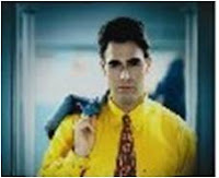
In 1995, the brand launched ultra bright colors in the formal segment. Colors like yellow, brown , red etc was introduced as formal wears. The yellow shirt featured in the TV commercial became a big hit among the consumers.

The brand further reinforced its cult status with the launch of wrinkle free cottons and checked formal shirts. The young restless generation lapped up the unconventional formals and used it as an expression of their personal freedom.

From the sales data,the company noticed that there was a huge demand for trousers of size 26-28 from women. Taking a cue, Allen Solly launched its range of women wear which was well accepted by the target group.

The competitors soon caught up with the concept of Friday Dressing. Every brand launched similar ranges and colors and soon relaxed formal wear became part of normal work wear. Allen Solly was valued at Rs 250 crore brand by now.

In 2009, the brand went for a repositioning exercise. Allen Solly found that there is a shift in the demographics of the target segment. While the workforce of 1990s were predominantly of the age group of 26 +, now youngsters of age 22-23 yrs have started entering the workforce. The brand wanted to be more relevant to the new young working class. Also the brand somehow wanted to attract consumers beyond the workplace.The worldview of the young consumers have also changed. Earlier success in life was measured based on work. But now the success is more holistic . Allen Solly wanted to reflect this change of perspective of the young consumers.

This thinking prompted the brand to change its positioning from a work-wear to a fashion brand. The brand positioned itself as a casual brand for all occasions.
To reflect the change in positioning, the brand changed its brand campaigns.In 2009, the brand launched its famous " I Hate Ugly " campaign targeting the youth.
The basic proposition was to reflect the irreverent , non-compromising attitude of youngsters towards life. This in-your- face communication struck a chord with the consumers and critics and the brand was able to break the earlier association of the brand as a formal wear.
The brand created a big noise in the market with I Hate Ugly campaign and it will be interesting to see how the brand carries forward the momentum.

Allen Solly also changed the tagline to " My World , My Way " to reflect the new brand proposition. My World , My Way reflects the strong individualistic view of the youngsters who own their world and create their own rules.

In a way, the brand has completely shed its earlier DNA. No longer the brand is associated with formal wears. The brand literally exited the category of relaxed formal wears which it has created. One reason can be that category itself became irrelevant since all brands have their own line of relaxed formal wear. Brands like Color Plus has successfully established itself in that category .

In the new avatar, Allen Solly is targeting the ever- fickle young generation whose concept of fashion changes by the day. The brand has identified a gap for a premium fashion brand specifically targeting this segment. Although brands like Levi's have a strong equity in the market, there is a gap for a player like Allen Solly.

Allen Solly's repositioning is a loss to the generation who saw the Friday Dressing avatar of this brand. Lets us hope that Allen Solly will repeat what it has done to the Work-wear market in 1993.
Friday, February 05, 2010

Brand Update : Cadbury Dairy Milk


Cadbury has launched a new variant of Dairy Milk branded as Dairy Milk Silk. The brand is currently running two TVCs for this variant

Watch the tvc here : Dairy Milk Silk Dance


The brand has been moving away from the celebrity endorsed approach it was following in the last few years. The new campaign is refreshing and brings back the memories of its earlier iconic campaign " Asli Swaad zindagi ka" . I liked the conference one than the dance one.

As I understand , Cadbury Dairy Milk Silk is a smooth and silky version of the original Dairy Milk. The brand is priced at a premium over the Diary Milk which makes it an Upmarket Stretch in marketing terms.

The ads are spot on the brand's core positioning of " enjoying the moments". The agency has conveyed the message in such a captivating manner that many adults who has forgotten about the original brand promise and experience will be attracted back to the brand.
I hope that the brand will scale new positioning heights and it is a learning experience to watch this brand evolving itself.


Related Brand


Saturday, December 05, 2009

Mont Blanc : A Story to Tell

Corporate Brand : Mont Blanc
Agency : Meridian

Brand Analysis Count : 432

Mont Blanc is an iconic brand. This luxury iconic brand is now making waves in India. Mont Blanc has a very rich heritage. Created in 1906, the brand was born in Germany. Mont Blanc was founded by stationer Claus Johannes Voss , banker Alfred Nehemias and engineer August Eberstein in Hamburg. The company was earlier christened as Simplo Filler pens but was later changed in to Mont Blanc in 1910.

Mont Blanc which started off as a writing instrument brand soon became an iconic accessory brand selling wallets , watches, jewelery, eye wear and fragrance. This brand thrives on luxury and exclusivity. More than a writing instrument, Mont Blanc is more of an art item, something to show off your success than a functional instrument.
The brand is also carefully crafted. Mont Blanc takes special care in ensuring that the brand communication is reflecting its exclusivity and premium positioning.

Mont Blanc entered India in 1995. The brand has adopted the strategy of slow skimming was initially available in premium boutiques at places like Taj Hotels.
Globally, Mont Blanc built its brand through print media. The brand crafted exquisite ads in the premium lifestyle magazines. This year, the brand deviated from its time tested media strategy and launched its first Indian TVC featuring Bollywood Actor Anil Kapoor and his daughter Actress Sonam Kapoor.

Watch the TVC here : Mont Blanc

Mont Blanc has the tagline " A story to Tell" . This is a positioning that takes the brand from a functional perspective to a higher level positioning. The brand talks about pen as a power to write one's own destiny. This is one of the best positioning statement I have seen in recent times.
In India, Mont Blanc is trying to tell stories of successful personalities who had achieved success not because of heritage but hard work.

The television commercial surprised me because of the choice of Anil Kapoor as the brand ambassador. Even though Anil Kapoor fits well in the brand's positioning based on " story to tell" and rags to riches kind of stuff, Anil Kapoor does not really gel with the over all brand personality of Mont Blanc.
He is an actor who has now virtually retired . Even during his hay days, Anil Kapoor was never considered as an iconic star. So by choosing a star who has faded from limelight seems to be a wrong choice for the brand.
Another question that came to my mind is whether Mont Blanc really needed a brand ambassador ? In the Indian advertising world, stars have become a commodity. These stars only give some 'stickyness' to the ad and other than that there is virtually no value addition to the brand equity.
In my personal opinion, Mont Blanc lost some its premiumness by choosing to get help from a celebrity.

Mont Blanc also was in limelight in India as a part of a controversy. The brand launched a limited edition Pen inspired by Mahatma Gandhi. The pen which was priced at around Rs 12 lakh generated enough controversy for the brand ( worth millions of dollars of free publicity).
The limited edition pen had Gandhiji's image engraved in the nib and also the top of the cap and cone was inspired by the spindle which Gandhiji used to spin cotton.
The limited edition pen with its huge price tag quickly captured the imagination of media and politicians who began a high profile debate on " commercialization of Gandhiji".

As an individual , I was happy that Mont Blanc chose to celebrate one India's finest son with a special edition product. I was more happy because they chose to price this special product with an exorbitant rate. I believe that Gandhiji is not cheap. He lived a humble life does not mean that everything about him should be cheap or priced low. If politicians can choose to use Gandhiji for furthering their goals, why can't brands ? And marketers are not fools to mess with a highly revered icon like Mahatma.

Mont Blanc is a brand that changed the way pens were looked at. The classic white flower-shaped symbol that adored the cap of this pen is considered an ultimate symbol of success. Mont Blanc does not need someone to make it a success it is the other way around.

Tuesday, September 22, 2009

Brand Update : Onida

Onida has launched its new campaign after putting the devil to rest. The campaign is aimed at repositioning and rejuvenating the brand. The brand is trying for a comeback after years of uncertainty which made this (once) iconic brand lose its share in the market.

Watch the new campaign here : Onida new campaign

In my last post on Onida, I commented that Onida's real problem is not branding but marketing. The brand desperately needed break-through products and embrace new technologies. If the new ads are any indication, the brand is moving in the right direction. The brand is trying to launch products with new features, which is the right thing to do .

Regarding the brand campaign, Onida now has a new tagline- " Tum Ko Dekha to ye design aya" meaning " Designed with you in mind ". The brand replaced the iconic devil with a new-age couple as the protagonists.

Onida is now repositioning on the basis of " Customer Oriented Design". The brand is saying that its products are designed with the new-age customer in mind. The new tagline has nothing new in it and "customer-oriented" design positioning is used by many brands before. In comparison with the classic "Neighbor's envy , Owner's Pride", the new campaign falls short of expectation. ( Another viewpoint here)

In the consumer durable space, it is the product features that attract the buyers not the ads. If Onida can give technologically advanced products at reasonable price, consumers will definitely try it out. But there are issues in such a product oriented strategy. Most of the new features can be copied easily by the competitors unless otherwise protected by patents. When Onida launches a DVD player which plays micro-sd cards, other players are bound to follow. It is in this scenario that branding becomes important. Onida needs to convince the consumers that its products are better designed and technologically superior. It is about managing perception .Features can be copied by competitors easily but changing perception is a difficult task.
Onida needs to work hard on creating and nurturing new perceptions about itself in the mind of the consumers. Long way to go for this brand......

Related Brand

Wednesday, September 09, 2009

Brand Update : Pears

It has been a long time since I wrote anything about Pears. The fact was that there was no big development about the brand for the past two years. The brand is regularly and consistently promoted across various media.

The brand extended itself to kid's category with the launch of Pears Junior and also into personal care segment with products like face wash. Pears also launched variants like Mint, Aloe Vera,Oil control etc during this period. Although the brand launched these variants, the core positioning of the brand remained the same for the original soap.

Recently I saw the new commercial of Pears
Watch it here : Pears

The brand is very consistent about the positioning strategy. Pears is built on the wonderful relationship between the Mother and
Child. All Pears ads captured this emotion quite perfectly. The brand focused on its " Transparency " and is positioned as a " Pure and Gentle " Soap.
This time too, the brand follows the same theme. The significant addition is that now Pears has a tagline - Masoom.
Masoom translates to Innocence . So Pears now celebrates a new brand value - Innocence.

The new campaign is nice but as a Southie I did not quite understood the dialogue. But the cute child and the theme always work the magic.
I am assuming that Pears brand is serious about the Masoom Tagline. Masoom concept works very well for Pears. The concept of innocence fits with the " transparency " and Pure & Gentle positioning.

Pears was one of those brands which did not have a tagline. With out the help of the tagline , the brand was able to communicate its core positioning. The core brand values of Pears was communicated through visual cues .
The tagline of Masoom seems to gel with the brand. Whether and how the brand is going to use this tagline in future is something to watch for.

Related Post

Monday, September 07, 2009

Brand Update : Onida

According to a report in Economic Times, Onida has decided to send its iconic mascot- The Devil to Hell. According to the report, the brand feels that Devil is no longer attractive to the consumers and hence the decision to remove it. The report further says that the brand is working on a new mascot.
The report gave me a sense of Deja_vu. This is not the first time that Mirc Electronics ( brand owners) has scrapped the Devil.
In1998, Onida withdrew the mascot citing the same reasons that they have given now. The explanation given in 1998 was that Indian consumers no longer find Devil, who symbolizes Envy, relevant. So they scrapped the famous tagline " Neighbour's Envy, Owner's Pride " together with the Devil. But ever since it changed the tagline and mascot, Onida never found a powerful positioning .

After six years of drifting around, Onida brought back the Devil with much fanfare in 2004. Media and brand enthusiasts welcomed the move and eagerly awaited the Devil in a changed modern avataar. But the comeback was damp squib. The brand suffered heavily due to ownership issues within the company. There was no brand promotion or new product launches worth talking about since 2004. If at all there were launches, promotions were not sufficient enough.

Now in 2009, Onida is redoing its old strategy.

Onida is facing a marketing problem and not a branding problem. Everything is fine with the brand. People recognize the brand, love its mascot. The issue is on a larger perspective. It needs to concentrate on its entire marketing mix not just the brand elements. Changing the devil and bringing in a new mascot is not going to do any good to Onida.

The Economic Times report suggest that Onida is changing its brand elements because of competition from Korean brands like LG and Samsung. These Korean majors has built its position in Indian market riding on Product strategy rather than on heavy duty brand promotions. Their products were good, reasonably priced and well promoted. In the case of LG and Samsung, nobody really cares about the tagline. For them , the product speaks for itself.

Onida failed because its products failed. I was a die hard Onida fan . I loved my Onida KY Thunder Television. But after that there was nothing remarkable about Onida. No high technology products came from this brand.Onida became successful because the Devil was backed by products that really created envy in others. Now there is nothing to envy about Onida. Last year, I bought an Onida DVD player which boasts about playing scratched DVDs but the product failed miserably.

Now in the consumer durable space, brands are coming out with new advanced products on a monthly basis. Technology keeps changing and most brands are moving with break-neck speed to catch up with consumer expectations. In the case of Television, flat is now old and brands are talking about plasma, LCD etc. What is Onida doing in this space ?

Onida is now in one of the most difficult times. The brand needs to come out with a product that will change the game. Changing the mascot is secondary at this point of time.
Related Post

Friday, August 07, 2009

Brand Update : Liril

In my last brand update on Liril, I mentioned the relaunch of Liril as Liril 2000. This week's Brand Equity carried a story about the new adventure of Liril 2000. Read it Here .
As mentioned in the report, Liril is currently repositioned as a soap that refreshes 2000 vital body points.

I was really surprised at the news that Liril is copying the international brand Lever 2000 of the parent Unilever. The positioning of Lever 2000 and Liril 2000 is the same. The only difference is that Lever 2000 is white in color.

I would say that this marks the sad demise of one of the iconic brands in India. Liril has lost its entire brand personality and now is degraded as the poor cousin of another brand. This is strikingly similar to the automotive brand Maruti Zen which again had this same sad story.

HUL in recent times is in the process of bringing in international brands by replacing Indian brands. Clinic All Clear has been changed to Clear. Now Liril is being morphed into Lever 2000.

This is very surprising that a company like HUL ,which has built some of the iconic Indian brands, resort to killing its brands to make way for brands from its parent company.

I cannot buy the argument that Liril 2000 was launched to rejuvenate the Liril brand. If you are rejuvenating a brand, why should you copy the positioning of another brand and import its entire brand elements and even advertising ? A possibility of Liril 2000 being rebranded as Lever 2000 cannot be ruled out . HUL is notorious for such extra-ordinary marketing practices.

If you were really keen on rejuvenating Liril, any person with common sense will tell you to bring back the old memories. A campaign with the old jingle and the imagery will instantly bring this brand back to life. Every newspaper, channel and blogs will write about the comeback of Liril. (Now also blogs and newspapers are writing but not praising the brand) . But alas....

To be fair to Liril, I liked the concept of rejuvenation and 2000 body points. I would have loved it ,if it was for Lever 2000 but not for Liril On the positive side, the old imagery and the ads are popular among a segment of consumers who has now become old. For the new generation, they may have heard about the famous waterfall and the girl but never have experienced the it in real time. So for an uninitiated 20 year old, Liril 2000 may be a new experience. That may be what HUL also is hoping for....

Related Brand
Liril
Brand Update - Liril


Wednesday, July 01, 2009

Brand Update : Pulsar

Faced with stiff competition from the likes of Yamaha, Honda and TVS Apache, Bajaj Pulsar have decided to strike back. The brand has been facing competition from the super bikes and was pressurised to hit back aggressively. Yamaha with its new launches and Apache are slowly eating away the market once owned by Pulsar. Pulsar reacted to this by launching new variants but on the promotional front, it was keeping silence.
In my earlier posts, I have been criticising this brand for being laid back in its promotions and commoditising its DTSI USP.
The brand has launched its revamped Pulsar 220 variant which will reinforce the brand's core promise of a performance bike.
Watch the new tvc here : Bajaj Pulsar 220

Although the ad is quite long , I really liked the climax.

And Hurray, Pulsar has a new tagline " The Fastest Indian ". After dumping the " Definitely Male " tagline, Pulsar ads never was a thriller. The product qualities made the brand a huge success. The ads just increased the familiarity and recall.

The new ad and new tagline gives a remarkable boost to this brand. And " Fastest Indian " is a very very powerful tagline. ( Hopefully Bajaj will retain this tagline for years to come ).
It is very wise for the brand to own the highest superlative . Pulsar has owned the " Fastest " superlative , that means another brand cannot be faster than the fastest. This gives a powerful boost to the brand itself. It all depends on how well Pulsar takes this proposition forward.

And being Fastest appeals directly to the target audience . Now in the promotion front, Apache and other performance bikes has to create a new superlative to beat the Bajaj.
The new ad is also well executed and packs the punch at the end beautifully . More than the ad, I liked the tagline.

It is good to see Pulsar getting the much needed promotional and creative boost.

Related Brand

Monday, June 08, 2009

Brand Update : Lays

Lay's is on a repositioning mode again. The brand is currently running a new campaign with a new tagline " Be a little Dillogical ".

Dillogical is the new manthra for the brand. The newly coined term represents the logic of the heart ( I think So !). The new campaign with the new tagline how ever does not speak much about the new positioning.

Ever since the brand dropped its famous " No one can eat just one " tagline, Lays has never really caught the consumer's share of mind. None of the campaign with the tagline " Har Program Ka Main Food " really was as effective as the previous campaigns.

In my last post about this brand, I had criticized about the decision to change a famous tagline just for the sake of change . I think the brand never found its soul in the " program ka main food " tagline. This may have created the need for a new tagline.

I don't think that the Dillogical tagline is going to be any better than the last one. Pepsi is obsessed with Hinglish words , the recent one being Youngisthan.

In sheer share of voice and creativity, Bingo has clearly outsmarted Lays. The campaigns of Bingo has always been clutter- breaking and funny. Lays never was able to bring out a classy campaign after its repositioning.

Related Brand
Lays


Wednesday, June 03, 2009

Brand Update : Liril

After a long long time, the iconic Liril is back. Yesterday I saw the new tvc for Liril. The campaign looks foreign, complete with foreign models and settings.

The new tvc talks about 2000 points in our body which when touched will refresh us!!!! The ad uses the theme of a playful interaction between a father and baby to drive home the power of touch and these 2000 sensitive body points.

The ad claims that using Liril will rejuvenate those 2000 body points to keep you FRESH...

Well... some brands will never learn from mistakes. After the dumping of the famous imagery of Liril girl and the waterfall, the brand has never recovered. The fall of this iconic brand was accelerated by some stupid campaigns like Uff Umma and mindless product-line extensions like Orange Liril.

Now comes another half-hearted attempt to rejuvenate the brand. Although the new ad has a touch of class, it does not gel with the brand image of Liril that we had in our mind.

Another interesting development is that the entire product has also being changed. The brand packaging has been changed to dark green and the shape of the soap is changed to rectangle.

I still don't understand why the brand has not thought about bringing back its iconic positioning on freshness and its brand element of waterfall and still famous music. I am not saying that the brand should exactly replicate the earlier ads but it can creatively take advantage of that brand image which is still there in the consumer's mind.

Liril's consumers has become old and the new generation does not know much about this brand. But the collective memory and images are still there in the consumer space. It is also interesting to note that no other brand has been able to take up the space of Liril. So there is still lot of opportunity for Liril but going by the new campaign, that opportunity has been wasted miserably.

As a consumer , I still miss this soap.


Related brand
Liril

Monday, January 12, 2009

Brand Update : Axe

Axe is a marketing phenomenon. This brand knows how to keep excitement ticking in the market. Last year saw the controversial Axe Dark Temptation making headlines . The brand has started 2009 with yet another launch - Axe 3 deo.

This is a unique innovative product where the brand asks the consumer to use two Axe Deos to gether to make a new fragrance. So Axe 3 comes in a combi-pack of two fragrances and the consumer can make a third one by spraying the two deos together.

Watch the ad here : Axe 3

Smart move indeed. Has anybody thought of combining two deos for a new fragrance ? ..

Axe 3 was launched in other markets in 2007 as a limited edition product.
A typical Axe 3 packs contains two deos marked 1 & 2. These cans should be sprayed together for a new fragrance.
The question is why should a consumer spend double the money for deos ? Why should he use two together and blow away double the money ?

The answer is that the brand does not expect every one to do so...

This is a product launched to keep the excitement going. That is the purpose of limited editions. All those Axe fans will try out this new product and competitors will have tough time matching this brand .

Axe has always been an unconventional brand. These seemingly outrageous innovations are in line with the brand's core positioning. And these launches gives enough reasons for Axe to advertise and that keeps the brand on top of the share of mind.

Related Brand

Axe

End Note : Neither the HUL website or the Axe Effect website carry any information about this new product launch. It is sad that a professional company like HUL did not have the common sense of regularly updating its websites.

Wednesday, October 22, 2008

Omega : The Choice

Brand : Omega
Company : SMH

Brand Analysis Count : 354


Omega is a leader in the Rs 600 crore luxury watch market in India. The brand which is an aspirational brand has a long history dating back to 1848. The brand had its origin in Switzerland in 1848 when a young man named Louis Brandt started assembling high precision watches.

But it was in 1894 that Omega as a brand was created. The brand and the company went through lot of turmoils through these periods. In 1930 during the depression, the company merged with other watch makers to form SSIH. The merger was to withstand the economic turmoil at that time.

In 1980 , the brand again went in to financial crisis. SSIH then merged with another watchmaker ASUAG to form ASUAG-SSIH. Now ASUAG-SSIH is owned by a private group and the company has been renamed as SMH. SMH owns some of the iconic watch brands like Tissot, Swatch , Longines and Rado.

Omega has been very active in the Indian market for the last four years. The brand was present in the country through imports but now with the government allowing single brand retail formats for foreign brands , Omega is in full swing to tap the Indian market.

Indian market is a unique market for the watch category. I was surprised to find that the penetration of watches among Indians is abysmally low. According to reports the penetration is only 27 %. That means only 27% of Indians own a watch. The total watch industry is around Rs 2500 crores in terms of value.

The market is broadly divided into low, mass market , premium and luxury segments. 85% of the market is for watches below Rs 500.

Although the bulk of the market is at the bottom of the pyramid, the top the line watch market is growing at a rate of 25 - 30 % . Most of the growth is attributed to the economic growth witnessed by India. With new jobs and profiles taking Indians to new heights of luxury, accessories like watches gain importance in the shopping list.

Its in this context that Omega began its aggressive campaigns in India. Now most of the business and lifestyle magazine have atleast one Omega print advertisement.

Omega's marketing practice is heavily depended on Celebrity endorsements. Its a brand that has successfully used celebrities to create differentiation. Its celebrity endorsers contain the who is who of the world. Some of the celebrity who has endorsed Omega are
Cindy Crawford
George Clooney
Michelle Wie
Michael Schumacher
Nicole Kidman
Ellen Macarther
Ian Thorpe
Michael Phelps
Eugene Cernan and
our very own Abhishek Bachchan

But the most celebrated and famous brand ambassador for Omega is James Bond. I think its the first brand that has a brand ambassador in a movie character rather than the actor. Bond has been wearing Omega watches since 1995 with the movie Golden Eye. The association has been strong and Omega celebrates the launch of the Bond movies through events and special editions. In the latest Bond movie , Daniel Craig wears an Omega Seamaster Planet Ocean 600m Co-axial Chronometer with a black dial.

These brand ambassadors give a special touch of luxury to the brand. But Omega is not dependant on any of these brand ambassadors and has a personality of its own. Omega is a classic case of a brand using celebrities to its advantage.

Along with the ads, the brand is also active in connecting to the customers through events. Like any other luxury brands, Omega also sponsors sports events because sports form an important part of lifestyle.

Omega was successful because of the secondary association of its country of origin ( Switzerland). The brand has its strength in quality, brand and its heritage. What has made this brand aspirational is the consistent campaigns with a common theme. The brand is positioned as the preferred choice or the rich and famous.

Omega has a distinct advantage derived out of its heritage and strong brand equity. Since Indian consumers are well connected with the world outside, the brand's campaigns using international iconic stars works well with Indian consumers. The brand has also added a touch of local flavor by adding Abhishek Bachchan to the list.

Thursday, August 07, 2008

Red Bull : It Gives You Wiings

Brand : Red Bull
Company : Red Bull Gmbh

Brand Analysis Count : 342


Red Bull can be called as a pioneer in the energy drink category worldwide. In India too, Red Bull was the brand that created the energy drink category.

Red Bull is a highly successful branding story. The brand came into existence in 1984. The brand was created by an Austrian professional turned businessman Mr Dietrich Mateschitz. The story goes like this.

The original inventor of Red Bull energy drink is said to be Chaleo Voovidhya, a Thai businessman . In 1962 he created a drink named Krating Daeng ( meaning Red Bull in Thai). In 1982 when Mr Dietrich visited Thailand, he came across this product which helped him to tide over the jetlag very quickly. Impressed by the product efficacy, Dietrich decided to take this product to Europe. He started Red Bull Gmbh with equity participation from Chaleo Voovidhya.

By the year 1987, Red Bull achieved a cult brand status across Europe and America.

The brand came to India in 2003. Although the brand has been keeping a low profile compared to the Cola majors , Red Bull has created a category of energy drinks in the Indian market. According to Economic Times ( 30.05.08) the energy drink market in India is estimated to be around 100 crore. The market now has two main players Red Bull and Power Horse.

Energy Drinks are not much popular in India or it can be said that this product is used mostly by sport persons hence a niche. So far the use of these kind of drinks has not percolated to the mass market.

From my childhood experiences, I used to take either fruit juices or products like Glucose powders ( Glucon-D ) to energize my self after playing.

The energy drink broadly comes under the category of functional drinks which is a bigger market estimated to be around Rs 543 crores.

Red Bull globally is known for buzz marketing. It is a brand which has built its equity through careful below the line marketing. During the initial launch time, Red Bull used to invest heavily in buzz marketing .
Some of the famous marketing strategy adopted by Red Bull is given below :

Student Brand Managers : The brand tried to reach the trend setters and opinion leaders by appointing ( informal agreement ) student brand managers across campuses. These members were given free Red Bull cans and was encouraged to organize parties for other youngsters.

Identify Hot Spots : The brand identified hot spots where the majority of consumers /opinion leaders gather. This could be a bar or a party area. Once these hotspots are identified, the brand campaigns in that spot.

Extreme Sports : Red Bull is adopted following brand qualities : Energy , Danger and Youthfulness. Hence the brand chose to sponsor or associate with extreme sports. At one point of time the brand also owned a Formula 1 racing team.

Athletes : Rather than roping in expensive celebrities, Red Bull sponsors high performing athletes who are not celebrities. One advantage of doing that is that the brand gets a highly dedicated brand loyalist from the fans of these athletes. According to Forbes Magazine, Red Bull sponsors more than 500 athletes.

Quirky Ads : Red Bull is a brand which was built without depending too much on advertising. The brand used advertising for reinforce brand identity rather than for selling the product. The ads of Red Bull has the classical cartoon format with a touch of humor.

Red Bull has the famous slogan " Red Bull gives you wiings ". The ads are revolving round this theme of the brand giving a high. One fact is that Red Bull need not do much of a product advertisements because the brand was confident that once the customer tries the product, he will start understanding the benefits of this product.

In India which is a market which is characterized by heavy duty advertisements, high profile celebrity endorsements and mouth watering sales promotions, Red Bull has managed to take the different route.
Since the launch the brand has managed to dominate the Indian market with more than 60 % market share . The popularity of Red Bull has prompted many cola majors to launch their energy drinks brand in India. There are news reports of Coca Cola and Pepsi bringing their global brands in this category into the Indian market.

Despite the success of Red Bull and Power Horse, there are stumbling blocks in the development of this category . The main issue is regarding the perception of consumers towards this category.

I always viewed this type of drinks with suspicion. Frankly speaking I had a perception that this energy drinks are associated with alcohol ( it was a perception). I was surprised to find that these products are targeted towards youth.And these products are more found in pubs and bars which further reinforced the perception that these drinks have parity with products like beer.

In the European markets, the consumption of beer and alcoholic beverages are not a taboo. Its a part of ones social life. But in India, the culture is different. The consumption of these beverages are not considered a part of social living. There are restrictions in consumption and availability of these beverages.

Red Bull is marketed heavily through pubs and bars across the western markets. But in India , Red Bull should keep away from associating itself with these kind of beverages. Because such an association will repel many customers especially ladies.

Having said that, this category also offers excellent growth potential also provided the brand rationalizes the price. The price of energy drinks vary between Rs70-95 per can which can restrict the frequency of purchase of this product.

Saturday, March 22, 2008

Brand Update : Cinthol

Cinthol , the flagship brand of Godrej Consumer Products Ltd is set for a makeover. The brand has roped in Hrithik Roshan as the brand ambassador. The new campaign is on air featuring Hrithik performing out -of- the- world stunts.

Watch the TVC here : Cinthol

Cinthol interestingly is the only masculine soap brand available in the Indian market. Ever after Lifebuoy repositioned itself targeting family, there has been no soap except Cinthol targeting male. The reason may be that marketers felt that soaps are usually bought for the family and used by multiple members . The decision of the soap brand usually is taken by the lady in the house. And moreover, soaps were never considered to be a part of the male grooming product category.

But things are different now. There is a marked shift in the consumer interest towards male grooming products. The category has expanded from shaving products, deo etc to face wash , hair care , face creams etc. The shift is also a result of the emergence of Metrosexual male and also of the Urban Nuclear Family where every individual members have the freedom to use individual products. So typically a modern household may see husband and wife using two different brand of soaps.

In this context , the relevance of Cinthol as a masculine brand achieves paramount importance for Godrej. Even without much promotion, Cinthol has a share of over 2 %. While Business Standards pegs the brand size to be around Rs 80 crore, Businessline puts the brand's size to be Rs 200 crore.

More than the new users, Cinthol's strength has been a strong brand loyal customers. This is both a strength and weakness. The prime challenge for Cinthol is to be relevant to the new Male.

The new campaign features a new look for Cinthol and a new slogan. The last ad of Cinthol featured the slogan " Get Ready Get Close " .
The new slogan for Cinthol is " Don't Stop" . The brand promise is
24 hour confidence &
Long lasting freshness.
Although the slogan has been changed, the positioning has been in a consistent line. Cinthol has long been positioned on the basis of the properties of Deo, freshness and confidence.
The new slogan tells the audience to have confidence to do what ever he likes. The execution of the concept is little out of the world but interesting to watch.

Regarding the choice of the celebrity , Cinthol has pulled off a coup by roping in Hrithik. But what I have seen is that Hrithik has not been exploited as a brand ambassador. Brands like Acer and even Coke was not able to fully exploit this celebrity.
My first impression about the ad is positive but the ad is not enough to raise the brand to a level of an icon. Having said that the slogan " Don't Stop " with core brand values of Freshness and Confidence give the brand lot of power to move ahead.

Related Brand
Cinthol