Showing posts with label Rebranding. Show all posts

Sunday, April 27, 2008

Brand Update : Ceat

The rebranding bug has caught Ceat too. The brand is now sporting a new logo. The saddest part is that Ceat has done away with the famous mascot ( Rhino) and the golden tagline " Born Tough".

The Rhino mascot has been with Ceat for almost 50 years. The tagline was also deeply etched in the mind of the public. According to Harsh Goenka , the reason for changing the mascot is that there is a general perception that Rhinos are getting extinct and is a sloth. ( Source : Financial Express). Hence the brand wants to change into something modern. I think it is one of the most unconvincing reasons for changing such a blockbuster mascot .
Currently the brand is promoting the new logo. The new logo is being promoted in the same way as Vodafone. Both TVC and print campaigns scream " Change is inevitable" and " Change is here ". No wonder the agency is O&M which handled the Hutch - Vodafone rebranding. The current campaign is a cut-copy-paste of the " Change is Good " campaign for Vodafone.

The brand also denounced its tagline " Born Tough ". The current re-branding campaign is only talking about the logo and the new tagline is not revealed.
The question now remains as to why a brand would want to change a mascot and slogan which is deeply embedded in the consumer's mind. It has to be noted that Ceat has never invested in the brand. Except for some occasional bursts of campaigns, Ceat never invested in the brand. If people still remember the brand, its because of the power of the mascot and the slogan and not because of any sustained campaigns. By denouncing the most powerful brand elements, Ceat has taken a big risk.
I think the current rebranding exercise is not going to be sustained over time. After the rebranding, the brand will again go in for a silent mode and also may be forgotten by the consumers.

Related Brand
Ceat


Friday, February 01, 2008

Accenture : High Performance , Delivered

Corporate Brand : Acccenture
Agency : Rediffusion /DYR ( In India)


Brand Analysis Count : 307


Accenture is a unique marketing case study because of two reasons . It is one of the most aggressive corporate brand in the service industry globally and the second reason is the rebranding exercise which it undertook in 2001.

Accenture was formerly known as Andersen Consulting. Anderson consulting was the consulting arm of Anderson Worldwide. Anderson Consulting was established in 1989 when the consulting practice of Arthur Andersen was hived off to form a separate company. Arthur Andersen had established itself as one of the major accounting firms and had a global presence.
The consulting boom of 1990's boosted the image of Andersen Consulting. Soon Anderson Consulting had built a strong brand equity across various consulting domains. Both Arther Andersen and Andersen Consulting was independent business units under Andersen Worldwide.

The fledging consulting business prompted Arther Andersen to enter the consulting domain. This entry of Arther Andersen into the domain of Anderson Consulting started a messy fight between these two units which ended in the arbitrators courts. In 2000 Arbitrator ruled that Anderson Consulting was granted independence from Andersen Worldwide . Andersen Consulting had to forgo the brand in favor of Andersen Worldwide.

This forced the consulting firm to scout for a new brand name and identity. The brand name was selected among 500 alternatives. The process of selection of brand name was itself a unique event. Anderson Consulting had a huge brand equity among various business houses across different domains and geographies . Hence the new brand name had to reflect the existing brand values and should be relevant in the various geographies in which the company operated. More over the brand name and trademark should be available in the markets where the company was operating.

The company made use of legal experts from each country it operates to check whether the list of brand names are viable in respective countries. The process of screening also involved linguistic analysts from 47 countries and 200 languages to check the cultural sensitivities of the brand names considered. The company also checked with senior executives of the clients to get their perspective. All these efforts ended with the name ' accenture' . Incidentally the name was suggested by an employee named Kim Peterson . This fact itself that gave the name more charm.

On January 1, 2001, the rebranding happened. For the first 3 months 6000 TV spots were aired and over 1000 print ads were splashed across the world. The entire campaign cost the company around $ 175 mn. The new campaign highlighted new capabilities in consulting, technology , outsourcing & alliances. The brand took the tagline : High Performance. Delivered. At the end of 2001, the brand achieved the same recall and equity of the earlier name Andersen Consulting.

Now Accenture is valued at $ 6.5 Billion and is a respected consulting firm across the world. Now the entire brand promotion revolves round Tiger Woods who is the brand ambassador. Since 2003, Tiger Woods has been an integral part of Accenture's branding. Tiger Woods is the embodiment of high performance so is Accenture. The latest campaign runs on the theme ' We know what it takes to be a Tiger '

Accenture came to India in 2005. The brand now has serious business in India and the brand is running their campaigns aggressively in the Indian market. The branding campaign is predominantly in print. The brand looks at the following audiences :
a. Domestic and potential clients
b. Potential employees
c. Existing employees.

What is more important in this brand's strategy is that Accenture celebrates performance. The campaign is not restricted to Ads but also lot of events and research. Accenture's research on High Performers and high performing companies are path-breaking. The website is also rich with case studies and insights.
Accenture is a true case of a brand living upto its values and manthra.

Friday, October 19, 2007

Brand Update : Airdeccan

It seems this is a season of rebranding. Along side the mega rebranding of Hutch to Vodafone, another high profile rebranding is taking place .... at Airdeccan. After the high profile and highly surprising " acquisition " of Airdeccan by Kingfisher, the brand is going through a makeover.
When the media announced that Kingfisher has taken control over Airdeccan, one thing that will have popped up in the mind of a marketer is about the brand "Airdeccan ".
How will Mallya treat Airdeccan ? was the million dollar question. Personally I thought that Vijay Mallya will keep the two brands in two different platforms. How dare one can even think of integrating a low-price brand with a lifestyle brand ? My reading was that Mallya will definitely try to cut unprofitable routes , may tweak a little with the level of service at Airdeccan but keep the brand at arms length from Kingfisher.
But what Mallya did with Airdeccan made me realize again that I am still a student of Marketing.
Airdeccan has changed completely. From the brand name, the logo, positioning and all the brand elements. Airdeccan is now " Simplifly Deccan " . The earlier logo of Hands has paved way for the Kingfisher logo. The color of Yellow and Blue has changed to Red. The old tagline has been integrated to the new Brand name and the new positioning statement is " The Choice is Simple ".
According to agencyfaqs.com, the rebranding exercise is costing around Rs 15 crore ( media spend).
The rebranding and the heavy secondary association with Kingfisher was surprising to me because I thought that it is highly risky for a premium brand to be associated with a price warrior brand. So any association of Kingfisher and Deccan may hurt the Kingfisher brand most. But having seen this repositioning exercise, I now have a changed point of view.
The new Simplifly Deccan is promising many things to the customer :
Excellence in timely performance
Wider Network
and more importantly " Little Delights all the way ". The new repositioning identifies all the weakness of Airdeccan. There were constant harping about poor customer service, delays and no free food. In blogs and forums , harried customers aired not so good words about Airdeccan while conveniently forgetting the fact that " You get what you paid for ".
Kingfisher has now bought in a breath of fresh air into Deccan. The Kingfisher airlines brand has established itself as a clear leader in delighting the customers by managing the Moments of Truth. Now that promise is being given to Airdeccan customers. And interestingly Mallya need not do much but just bring in the culture to Deccan. Deccan already have good planes, crew and infrastructure. Bring in Kingfisher culture will be the key change that we are going to see in Airdeccan... sorry... Simplifly Deccan.
The new positioning is also significant. The positioning of " The choice is simple " takes strength from the famous old tagline :Simplifly. It builds on the old platform and aims to be the " preferred airline " for the discerning customers.
So the questions remain. Will Kingfisher brand suffer by associating with a low price brand ? May be no because price was not what Kingfisher is all about. Whether it is Kingfisher airlines or the beer, the brand never was an expensive one. The focus was on experience and lifestyle. There can be huge expectations about the new Deccan and people ( including Kingfisher loyalists ) will try out the new Deccan but will see a clear demarcation on the service levels between the two. The Kingfisher experience will be limited to Kingfisher airlines but you will get a teaser of that in Deccan ( that may be the idea). Having said that , this rebranding exercise is definitely a risky affair for Kingfisher brand.

Related Brand
Airdeccan

Sunday, October 14, 2007

Brand Update : Ultratech

After the success of the heavy duty rebranding exercise of L&T Cement to Ultratech, the brand has undertaken yet another branding venture. This time its not a rebranding but a brand migration. Aditya Birla Group has a premium composite cement branded Birla Plus. The company is migrating Birla Plus to Ultratech. Birla Plus was launched in 2003 and was being positioned as a Premium brand. The brand has been promoted across the media with the tagline " Is Cement main Jaan hai ". Now the high profile migration ads are on air. The rationale is very simple , both Ultratech and Birla Plus are premium brands from same stable. There is a chance of brand cannibalisation. The group feels that all premium cement offerings should be bought under the Ultratech brand for better synergy and cost rationalization.
The company has proved that if there is huge reserves of money, rebranding is not an issue. I feel that Birla Plus brand has lost its relevance when Ultratech was introduced. In the positioning front also, an emotional positioning taken by Birla Plus does not have relevance in the commodity business. By bringing all premium offerings under Ultratech, the company will be able to spent is promotional budgets more effectively.
Related Brand
Ultratech

Tuesday, June 26, 2007

Hindustan Unilever Ltd : Adding Vitality to Life

Brand : Hindustan Unilever ltd
Company: HUL
Agency : Lowe


Brand Count : 243

Its now official. From today onwards, Marketers have to learn to call India's Largest FMCG company by its new Name : Hindustan Unilever Ltd. The company has officially rebranded itself.
According to the press release, the rebranding aims to align this brand along its global positioning of the parent Unilever.

According to the CEO of HUL Mr Douglas Bailey the new logo and name symbolizes the idea of vitality. He says

“The identity symbolises the benefits we bring to our consumers and the communities we work in. Our mission is full of promise for the future, opening up exciting opportunities where we have competitive advantage for developing our business and our new identity will help us confidently position ourselves in every aspect of our business.”

There is more to the new logo than it meets the eye. The logo is a combination of 25 icons that symbolizes the vision and mission of the company, the brands and the concept of vitality. The new corporate brand takes the tagline " Add Vitality to Life".
The twenty five icons form the unique U of the new corporate logo.

Incorporated in 1933 as Lever Brothers India ltd and adorning the name Hindustan Lever ltd in 1956, HLL never was serious about its corporate brand. All these years, this FMCG giant was building individual brands.
It was in 2005- 2006 that HLL seriously began to use its corporate logo in its TVC's. The company felt that a powerful corporate brand can give power to individual brands especially the new brands.
This year, the company made a huge change in its logo and the name.From the reports, I feel that the company is embarking on a serious corporate brand building activity in the years to come. This makes sense because theoretically Corporate brands Legitimizes products and individual brands individualizes it. This was important for those product categories which need to establish trust because of high cost or high customer involvement. Hence you can see consumer durable brands and automobile brands using both Corporate Brands and Individual brands together.

The current rebranding of Corporate brand is not going to make a difference in HUL's position in the market. The reason being that all of the HLL's brand stand independently from the corporate identity. I also doubt whether customers care about the company behind the Surf ?
The new brand is also unique since it is the only market in the world where Unilever has allowed the use of regional name . To show solidarity to Indian market, Unilever is retaining the term Hindustan in the new brand name.

Tuesday, May 22, 2007

Poppins : Goli Rainbow Wali

Brand : Poppins
Company: Parle

Brand Count:234

Poppins is a heritage brand. Although I am not sure when it was launched, I am pretty sure that this brand is more than 30 years old. Still this brand is existing in the market now in a second life. Poppins comes in the category of hard boiled candy in the Rs 1200 crore confectionery industry.According to businessline, the hardboiled candy market is estimated to be Rs 350 crore and is dominated by Alpenleibe.

Poppins is a unique product because of its product characteristics. For me, the brand evokes a feeling of nostalgia since this was among the most popular brand when I was a kid. Poppins was liked by us because of its taste, color and ofcourse economy. Where else can you get 10 candies in a packet that too in different flavours .
But things changed last decade with the entry of aggressive players and new products. The market witnessed lot of segmentation and new categories and product forms evolved. Poppins at that point of time had lost its way.
Poppins were positioned on the platform of its range of flavors and color. The brand during the early times spent lot of money on brand building. The brand used two characters Ram and Shyam and used cartoon stories to build this brand ( source:vishalpatel.com). Since there was not much competition from organised sector, the brand had a good run.
But during the recent times that is from 2000-2007, the brand kept a very low profile. Although there are reports of a rebranding exercise during 2002, I don't remember any ads on air during this period.
This year however, has seen some action for this brand. TVC's are now on air using the Colors as the main USP. The website and the wrapper shows the tagline "Goli Rainbow Wali" which points towards the rainbow colors of the candies. Although the TVC's looks OK, I don't see any meaningful positioning for the brand except that the ads highlight Rs 2 and also the colors.I think that the brand wants to say to the customers that in this expensive world, you still get a Poppins for Rs 2.
Parle Poppins like Cadbury's Gems is a unique brand because of its product characteristics. Although both of these brands face competition from fake products, there is no serious brand competition for Poppins. But still like all heritage brands, this brand also faces the issue of being relevant. I feel that Poppins is looking at small kids aged 5-10 as its target segment. Because the ads are too kiddish.But I am glad that Poppins is back...

Imagesource:vishalpatel.com

Friday, March 10, 2006

VIP : Bye Bye, Bye Bye !

Brand : VIP
Company : VIP industries ltd
Agency :Lowe


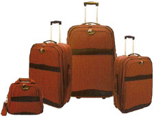
VIP is the undisputed market leader in Rs 1200 ( some say it is 600 crore) crore Indian Luggage industry. Launched in 1971 VIP aimed to capture the market dominated by unorganized sector. Indian Luggage market is largely consisting of soft luggage and moulded luggage.

The luggage market is going through a tough time with low demand and stiff competition from unorganized sector. In India since the frequency of travel is low, the luggage manufacturers are facing a unique problem. The product is a high involvement product at the time of purchase but after the purchase the interaction with the product is limited. Hence marketers find it tricky in keeping their brand at the top of the mind of customers.

VIP has established itself in the Indian market using product innovations, stress on quality and brand building. VIP was the first to introduce “non reversible multi safe lock”, soft grip handle, dual action lock and central locking system. These innovations together with brand building made VIP a market leader.

Then VIP faced the problem faced by most of the giants: the brand becoming generic to the category and local brands eating into the share of the company.
In 1997 came a formidable threat to VIP – Samsonite. With in short time Samsonite established its presence in the luxury segment of the market. While VIP was very dominant in the mid- segment, it had no presence in the luxury segment. Samsonite posed a major threat to VIP and garnered a market share of about 35% in the luggage market with in a short period of time. This forced VIP to seriously reconsider its marketing strategy. To counter the threat of Samsonite, VIP launched Elanza range of premium luggages. Samsonite meanwhile also wanted to enter the popular segment ( 800- 2000 range) . It launched the brand “American Tourister “ to enter this segment posing a major threat to the market leader. More over Samsonite had an international contemporary look and appealed to the new generation than VIP which was not perceived as a vibrant brand.

Inorder to attract the new generation and create a new brand identity, VIP embarked on a rebranding exercise. The usual ads of VIP was appealing to the middle class and focusing more on emotion. The “ Kal Bhi, Aaj Bhi” ads were very powerful and appealed to the middleclass. But since the consumers changed, inorder to succeed, the brand had to have a contemporary look.

The new strategy of VIP is focusing on capturing or owning the concept of “Travel”. The logo was changed to a more contemporary logo and the ads were changed to communicate the new positioning. The agency thought of the most appropriate moments of travel and decided that the “ time of departure “ is the most critical constituents of travel. The ads aimed to tie the brand to Travel. Thus originated the “ Bye- Bye “ campaign with a very youthful imagery that appealed more the new generation travelers. The baseline was changed to “ Happy journey” thus attempting to own the concept of traveling.

The new campaigns were supported by new ranges of products. The sub brands of VIP include Delsey (international brand from France) to capture the premium segment, Footloose: the trendy bags for the youth, Buddy: school bags and Alfa: value for money segment.
VIP is a market leader that is trying hard to retain its leadership position. It had failed to create barriers for competition by keeping many categories open for competition to enter. Now also leather bag category is now seeing lot of action with big players like Hidesign taking the lead. VIP does not have a presence in this segment.

But with its strong brand equity and ability to change with the consumer trends will help VIP in its future battles.

VIP : Happy Journey